SAT Mastery Series: Reading Deep Dive – Charts, Graphs, & Data (Module 18)
You're staring at a dense passage about climate change, and just when you think you're getting the hang of it, bam, there's a graph with multiple data points, weird labels, and a question asking you to pick which statement the data "supports." Your brain freezes. Do you analyze the graph first? Read the text again? Guess and move on?
If this sounds familiar, you're not alone. The SAT loves to throw charts, graphs, tables, and scatterplots into the Reading section, and most students hate them. Why? Because they feel like a pop quiz within a pop quiz. You're juggling words, numbers, and visuals all at once, and the clock is ticking.
Here's the good news: These questions are actually some of the easiest points you can grab on test day, once you know the system. This module is going to teach you how to read SAT graphics without getting overwhelmed, spot the traps the test writers set, and nail those data interpretation questions with confidence.
Let's break it down.
The "Labels First" Rule: Your Secret Weapon
When you see a graph or table on the SAT, your first instinct might be to dive into the numbers. Wrong move. That's like trying to read a book starting from the middle, you're going to miss the context you need.
Here's the smarter approach: Always read the labels first.

Every SAT graphic has three critical pieces of information hiding in plain sight:
- Title: What is this graph even showing?
- Axes/Column Labels: What do the X and Y axes represent? What are the units?
- Legend (if present): Are there multiple data sets? What do the colors or symbols mean?
Think of these labels as your treasure map. Once you know what you're looking at, the actual data points become way easier to interpret.
Quick Example:
Let's say you see a bar graph titled "Average Annual Rainfall in Four Cities (2010-2020)." The Y-axis says "Rainfall (inches)" and the X-axis lists City A, City B, City C, and City D.
What do you know before looking at a single bar?
- This graph compares rainfall amounts across four cities
- The data spans a decade (2010-2020)
- The measurement is in inches
Now when the question asks, "Which city experienced the highest average rainfall?" you're not guessing, you're just finding the tallest bar.
Strategy: "Direct Match" vs. "Synthesis" Questions
Not all SAT data questions are created equal. The test throws two main types at you, and recognizing which one you're facing will save you tons of time.
Type 1: Direct Match Questions
These are the "gimme" questions. The answer is directly stated in the graph or table, no critical thinking required. You just need to find the right data point.
Example: "According to the table, what was the population of City B in 2015?"
You literally just look at the row for City B and the column for 2015. Boom. Done. Don't overthink it.
Type 2: Synthesis Questions
These are trickier. You need to combine information from the graph with information from the passage. The question might ask:
"Which statement about City B is supported by both the text and the data?"
Now you're cross-referencing. The passage might say, "City B experienced significant industrial growth in the 2010s." The graph might show a population increase during that same period. If an answer choice connects those two ideas, that's your match.

The Key: Synthesis questions require you to think like a detective. You're looking for evidence that appears in both the text and the visual. If the graph shows something that contradicts the passage (or vice versa), that's often a trap answer.
The "True But Irrelevant" Trap (And How to Avoid It)
Here's where students get absolutely wrecked on SAT data questions: they pick an answer that's factually correct... but doesn't answer the question.
Let's say the question asks: "Which statement is supported by the data in the graph?"
And here's one of the answer choices: "City A has a larger population than City C."
You look at the graph. It's a bar graph about rainfall, not population. City A does have more rainfall than City C, but the answer is talking about population, which isn't even shown in the graph.
This is a trap. The answer might be true in the real world, but it's not supported by this specific graph.
Tutor Script for Avoiding This Trap:
- Read the question stem carefully. What exactly is it asking you to find?
- Check the graph. Does it show the information the answer choice is claiming?
- If the answer sounds right but the graph doesn't show it, cross it out. No exceptions.
Practice Time: Let's Get Our Hands Dirty
Alright, theory is great, but this is where you actually level up. Let's walk through some real-world scenarios.
Practice Question 1: Direct Match
Scenario: You're reading a passage about renewable energy. There's a table showing "Wind Energy Production by State (2020-2025)" with columns for each year and rows for Texas, California, and Iowa.
Question: According to the table, which state had the highest wind energy production in 2023?
Tutor Script:
- Step 1: Look at the column labeled "2023."
- Step 2: Scan down the column and find the largest number.
- Step 3: Match that number to the row, that's your state.
- Step 4: Double-check that you're looking at the right year. The SAT loves to make 2022 and 2023 sit right next to each other to trip you up.
This is a classic Direct Match. No synthesis, no deep thinking, just find the number and move on.
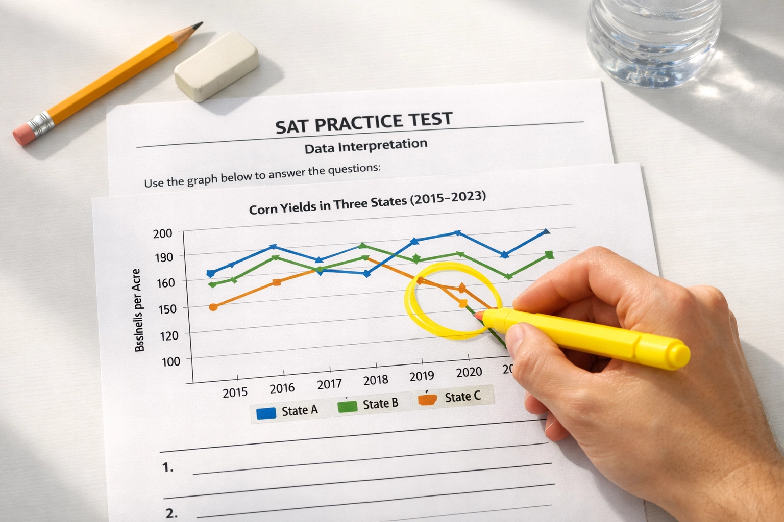
Practice Question 2: Synthesis
Scenario: The passage discusses how drought conditions affected agriculture in the Midwest. A line graph shows "Corn Yield per Acre (2018-2023)" for three states: Illinois, Nebraska, and Kansas.
Question: Which claim from the passage is most directly supported by the data in the graph?
Answer Choices:
A) Illinois farmers used more advanced irrigation systems than Nebraska farmers.
B) Corn yields in Kansas declined sharply between 2020 and 2022.
C) Nebraska produced more corn than any other state in 2023.
D) Drought conditions had no impact on corn production in Illinois.
Tutor Script:
- Step 1: Read the question carefully. We need a claim from the passage that's supported by the graph.
- Step 2: Eliminate choices that aren't about yield. Choice A is about irrigation systems, nowhere on this graph. Cross it out.
- Step 3: Check the graph for Kansas between 2020 and 2022. If the line drops significantly, Choice B is supported.
- Step 4: Check Choice C. Does the graph show total production or yield per acre? If it's yield per acre, we can't determine total production. Cross it out.
- Step 5: Check Choice D. If Illinois shows a yield drop during the drought years, Choice D is contradicted by the graph. Cross it out.
The Winner: Choice B. The graph visually confirms the decline, and the passage likely mentions it. That's your synthesis.
The "Smoking Gun" Evidence Strategy
Here's your mantra for SAT data questions: If you can't point to it, it's not there.
Think of the graph like a crime scene. The evidence has to be explicitly visible. No assumptions. No "well, this probably means..." If the graph shows a line going up and the answer says it's going down, that's not your answer: even if it sounds smart.
Pro Tip: Use your pencil. Literally circle or underline the data point you're using to justify your answer. If you can't physically mark it on the test, you're probably guessing.
Common Pitfalls to Watch Out For
Even students who understand the strategy still fall into these traps. Here's your cheat sheet:
Mixing Up Units: The graph measures temperature in Celsius, but the answer choice talks about Fahrenheit. They're not the same: cross it out.
Confusing "Increase" with "Highest Value": A 10% increase from 20 to 22 is still smaller than a flat value of 50. The SAT will test whether you understand the difference.
Ignoring Time Periods: The graph covers 2015-2020, but the answer choice makes a claim about 2021. Nope. Not supported.
Falling for "General Knowledge" Answers: You might know that City A is bigger than City B in real life, but if the graph doesn't show it, it's wrong.

Putting It All Together
Let's recap the system:
- Labels First: Always check the title, axes, and legend before looking at the data.
- Identify the Question Type: Is this a Direct Match or Synthesis question?
- Find the Evidence: Circle the exact data point or trend that supports your answer.
- Watch for Traps: Eliminate "true but irrelevant" answers and check your units.
- Trust the Graph: If you can't point to it, it's not the answer.
The SAT Reading section isn't trying to test your ability to memorize facts about climate science or economics. It's testing whether you can read a graph accurately and connect it to a text logically. Once you see the pattern, these questions become some of the fastest points you'll score on test day.
Ready to practice? Head over to our full SAT course library for more modules like this one, or dive into our other SAT Reading Deep Dives to keep building your skills. You've got this. 🚀